
What did I learn from this opportunity?
Reflections
Insight:
A key takeaway from this project is the importance of constructive feedback. In collaboration with Gabby, we engaged in regular, insightful feedback sessions, which allowed us to identify areas for improvement in both our design practices and teamwork dynamics. This exchange of feedback proved invaluable in refining our processes and ensuring continuous growth as both designers and collaborators.
Moving forward, I plan to conduct user testing of the final prototype with a diverse group of Dart riders, spanning both new and current users across various age demographics. This approach will provide a broad spectrum of insights, allowing us to gather comprehensive feedback and enhance the overall design.
Iteration is key!
Flow 03:

Each journey completed by the user accumulates points, fostering continued interaction with the app. These points are redeemable for exclusive benefits, which are curated through partnerships with local businesses within the Dallas area. By seamlessly integrating this rewards system into the commuter experience, we incentivize positive user behavior and drive traffic to local businesses, enriching the overall community connection.
Perks and passes

Flow 02:
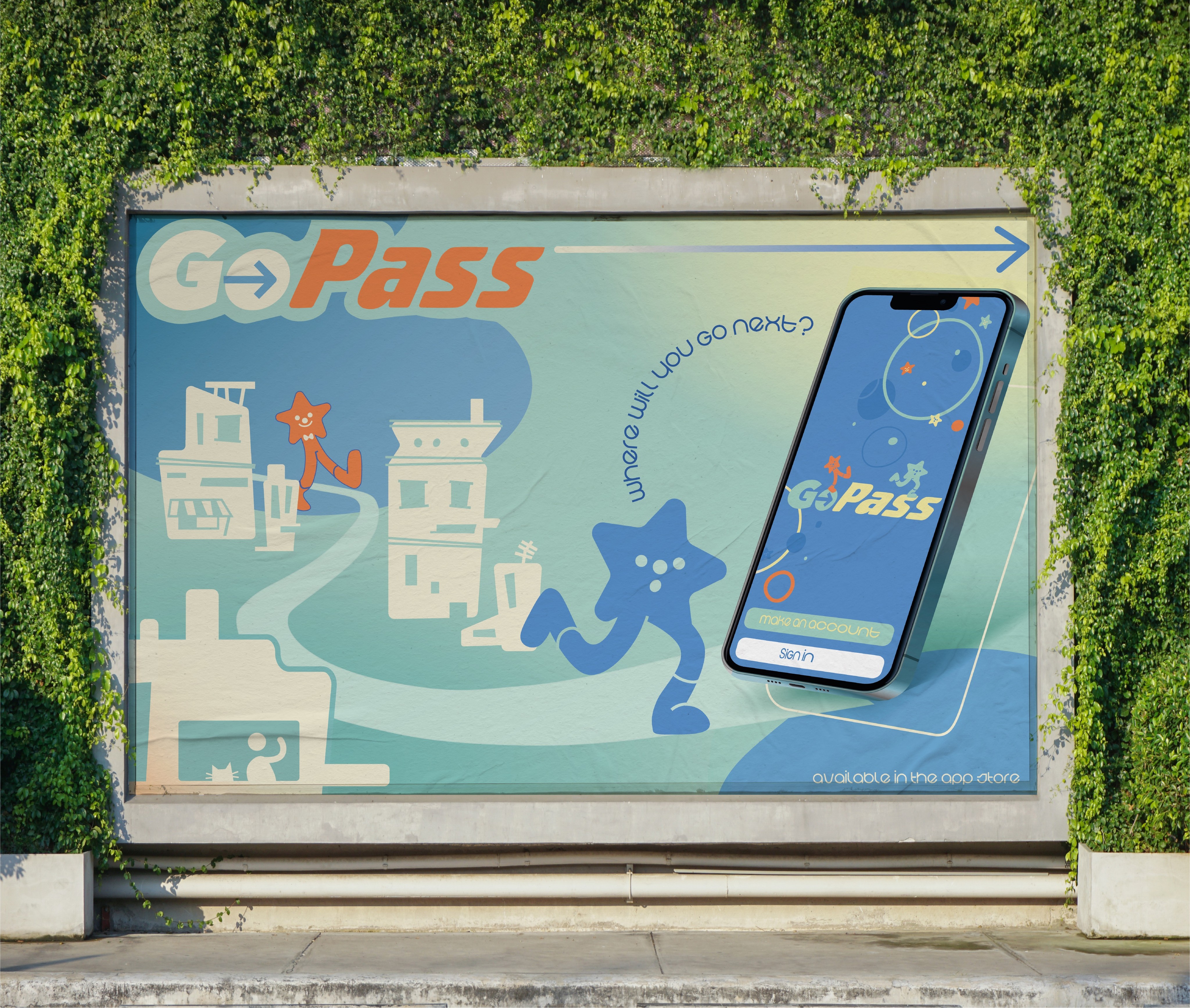
GoPass was reimagined to have a much more playful and energetic identity to enhance user engagement, foster a dynamic and intuitive experience that ensures the app aligns with modern design principles and promotes ease of use through vibrant visuals and seamless interaction patterns.
HomePage
Flow 04:

With the multiple events and perks available for sign-up, there is a dedicated space within the app where users can easily access and view them in chronological order, ensuring that upcoming opportunities are prioritized. This feature leverages a streamlined, intuitive interface that allows users to quickly identify relevant events and perks based on their schedule, enhancing discoverability and reducing friction in the user journey.
Organization
Flow 01:
The GoPass homepage has been redesigned to facilitate a seamless user experience, enabling effortless sign-up for community events. It offers clear, concise information and an integrated registration process, eliminating the need to navigate away from the app.
Events

With a commuter-first mentality, we centralized our efforts on reimagining GoPass' mobile presence. Complementing DART’s mission to connect communities with seamless mobility, our mobile application provides commuters a reimagined experience that places community first, by streamlining event sign-ups, a rewards system, and an engaging interface designed to delight Our vision of the DART mobile application aims to make commuting more than just transit, creating connection effortless for everyone, everywhere.
Synthesis:
Core Experiences


SOlutions
What are the details, changes, and improvements with the new design?


Users indicated a need for greater clarity regarding the event’s purpose, with many suggesting that the organization should provide a more explicit explanation of its content
Users expressed a preference for the reward system and incentives to be distributed across separate areas, citing concerns over cognitive overload and confusion regarding the location of specific elements
Users noted a lack of context in the nodes, along with an excessive amount of text
Users are uncertain about which nodes are blocked and which ones are accessible to them
Users expressed a need for clearer contextual information regarding the information hierarchies, specifically in terms of understanding the destination of links.
Users expressed a preference for a more visually enhanced version of the "Daily Pass," where additional visual elements would improve information hierarchy and cognitive clarity
Users wanted more context to the nodes, majority wanted to see the date of the event to seen at a glance and rearrange the information accordingly
Users preferred newly unlocked incentives to be displayed over bookmarks for visual consistency, as the map feature already utilizes this approach
Overview:
Using our mid-fidelity prototypes, we conducted 6 user tests on both frequent and inexperienced GoPass users.
Feedback
Points page
Overview:
After finalizing our wireframes, we progressed to mid-fidelity prototyping, incorporating visual hierarchy and UI elements to enhance the overall aesthetic.
We used a whimsical, mascot-driven identity to make GoPass more engaging and memorable, appealing to young adults and frequent riders. This playful approach transforms transit from a mundane task into a visually dynamic and enjoyable experience.
We developed multiple iterative designs, prioritizing user flows to ensure intuitive navigation. Our goal was to gather actionable insights during user testing on how effectively each screen interacted within the broader experience.
Mid Fidelity
Incentive nav.
Events extra info.
Home


Overview:
With ideas brewing, we ideated individually and then collaboratively decided on the potential features that we wanted to explore. We proceeded to sketch out low-fidelity prototypes of the core screens. During this stage, we focused primarily on screen composition and element placement.
Initially, we explored feature integration within the map interface but ultimately shifted our focus to optimizing the primary touchpoints—the Homepage and Wallet Page—as these were the areas where users spent the most time navigating.
Low Fidelity


Ideations
How do you redesign an existing app?
Insight:
With this objective in mind, we formulated the following problem statement to guide our design processes:
How might we reimagine a transit app like GoPass to promote a more
transit experience for young adults in Dallas?
streamline
Community-Driven
Engaging


To enhance engagement, the design should focus on improving information hierarchy, providing contextually relevant event details upfront, and reducing cognitive load by streamlining the sign-up process. Implementing seamless call-to-action placements could transform the feature from a passive reminder into a highly usable and engaging experience that aligns with user needs.
“I don’t really use the events stuff much, mostly it just serves as a reminder. I think it showing more specific information for easy sign ups would be good.
-Anonymous, 24
Pain Point 02:
Systems, like transit, should be designed so that the user can complete tasks or decisions quickly. DART, Dallas Area Rapid Transit, realized the importance of community connections and create an "Events Tab" in the Homepage.
Users, however, rarely engage with the feature despite recognizing its value, indicating friction in the user journey. The content design lacks depth, providing minimal event details, which reduces perceived usefulness. Additionally, the interaction flow is cumbersome, requiring too many steps to complete registration, leading to drop-off and task abandonment.
Hard to Connect
-Anonymous, 27
"I mostly ignore it because I have to open my browser to actually RSVP. I usually have to open other apps just to know what it's about which is pretty annoying."
Pain Point 01:
A strong design system reflects a community's values, culture, and identity, fostering a sense of connection among users. Without this, the app can feel generic, especially to younger transit users who value local relevance. This disconnect risks reducing user engagement and loyalty, undermining the app's effectiveness.
The design system also made users struggle to quickly access key areas like day passes and wallet sections, leading to frustration and inefficiencies.
lack of Identity
The interface right now looks dull, text-heavy UI can feel overwhelming, while an intuitive, visually distinct system helps users scan and act quickly. Furthermore, users touch upon having a more gamified elements and personality-driven interfaces. A fun system creates a positive emotional association, making them more likely to engage and return.

-Anonymous, 22
“I just wish the apps looked more interesting—like made it more cute or something. Right now, it’s functional, sure, but I feel like it I would use it
more if it looked more unique.”
"Running to the bus stop and getting out my pass to scan gives me so much anxiety-I want to just get in with no hassle but I keep fumbling with around the app to find it and I hold up a line."
-Anonymous, 18
what is it like?
Research:
Redefining a well used transit experience to be more community oriented is a particularly arduous task to create, so we did comprehensive research to learn how users navigate the space, who use it the most, their critiques and how creating a community base could help.
42
Survey
Respondents
6
Interviews


5
Competitive
Analysises
How does transit impact a city's community?
Defining the Problem
My Role:
Working closely with my team members, we split major tasks between ourselves - mine being primarily building and ideating the new interfaces and interactions of the proposal. I took more on with this project, which allowed me to make important decisions and take the role of a lead designer in the group.
Leading the Designs
Project Context
Overview:
As a final project, students were challenged to redesign apps or systems in America that could benefit from an improved user experience which fosters connection and community engagement.
My group and I were assigned to redesign Dallas' transit app, GoPass, with a focus on conceptualizing a new transit experience that does more than wayfinding.
Our goal was to improve GoPass' design system and create a more inclusive and community-driven experience for riders.
Role:
User Research
Product Design
Interaction Design
Product Thinking
Head of Team
Duration:
2 weeks
Tools:
Figma
With:
For:
Dallas Area Rapid Transit (DART)